Get Upto 60% Discount
Grab 50% Discount
for all custom logos
Please fill the form below & proceed
Kindle Your Logo Design with 44 Captivating Color Choices for Your Next Masterpiece

July 27 , 2023 Posted by admin
Every company’s brand needs a set of colors for its logo. Even if you only use black and white or a few shades of gray, your logo color scheme still has colors. Logos with color schemes help brands show who they are. Color sends important messages to the brain about how the viewer feels. People will discover who you are and what you do by looking at the colors in your image, even before they look at it more closely or hear your company’s name.
Logo color schemes are made up of different colors that work together to make a company stand out. The colors you choose for your business logo design will significantly affect how well it does and know about your business performance.
Want to explore how brands use color for their corporate logo designs? Keep reading to grab great logo design ideas for colors you could use in your logo creation, either for a mascot logo design, 3D logo design, monogram logo design, abstract logo design, or any other logo type.
For your logo design, color makes people feel something emotionally, sends messages and has a solid visual effect. Setting the scene, improving the design, and keeping the audience’s attention is essential.
Depending on your firm and how you wish it to look, you may need more than one color for your business logo. Logos generally have one primary color and one or two accent colors for two or three colors. On the other hand, some names work well with just single color or a few shades of the same color. The color scheme should visually show the story and attitude of the brand.
Revamp your brand with a captivating corporate logo design from us. Our USA logo designers are professional in designing all types of logo designs, such as abstract logos, mascot logos, abstract logos, 3D logos, animated logos, emblem logos, monogram logos, and pictorial logos. Get started today!
You can make your logo using one of the 44 unique color schemes below.
Bold logo color mixtures
Using highly vibrant colors is the best way to give your logo design life and energy and make the perfect bold brand.
- A brand that makes a statement needs high-energy colors like red, orange, and black.
- Blue and gold are a good contrast for an image that stands out.
- Purple and yellow are a happy and bright pair.
- Red and black are colors that stand out and get people’s attention.
- Red, black, and white stand out because they are serious and important.
- Black and yellow stand out, and they make each other stronger.
- Unconventional and edgy, with a mix of fire and ice, are red and blue.
- The difference between purple and orange is hard to resist.
- Pink and yellow are bright, happy colors to get people’s attention.
“Look-alike” logo color mixtures

Some brands choose colors that make them think of specific things, people, or places. A popular way to use colors in this way is to give abstract shapes and colors that tell the viewer right away what they are, like blue squiggles for water or dots in colors that look like skin for people.
- Orange, blue, and navy are relaxing colors that make people think of the sea and sunsets.
- Green and brown from nature shows that a brand likes the outdoors and gardening.
- A lively blend of orange, yellow, and red that is meant to make you think of sunlight, heat, or fire.
- Pink/red and white, the color scheme is happy and innocent, making it perfect for snack foods or brands aimed at younger people.
Peaceful logo color mixtures
When you mix a pure color with white, you get a tint, a muted, pastel version. You can use it to tone down brighter colors, and also excellent are blues and grays.
- The mix of dark blue and pale pink brings to mind the calm of dawn.
- Green and blue tones are soothing, relaxing, and great for making people feel at ease.
- Beige and light purple are quiet and peaceful colors that work well for a soothing color scheme.
- The combination of green, yellow, and orange is suitable for brands for a broad group of people.
Even though green and orange don’t go together as well as green and yellow, they still make an excellent, soft color scheme. Orange gives the image a stronger sense of urgency than yellow, which makes it stand out in a crowd.
Natural logo color mixtures

Create a logo that captures nature’s beauty using Earth-inspired colors from a standout photo of a natural setting.
- Unusual earth tones like pinks, reds, and yellows that are bright and grounded.
- Blue, green, and tan are the color scheme that makes viewers think of beautiful skies and sparkling oceans, so it’s great for a natural feel.
- Brown and black are reliable and old-fashioned; these colors are great for retro or traditional names.
- The colors yellow and orange remind us of sunny days because they are warm and easygoing.
- Orange and red, which are bright and stand out, are great for making a statement.
- Burnt sienna and yellow for a desert look or dark blue, white, and gold for an Arctic theme.
Fun logo color mixtures

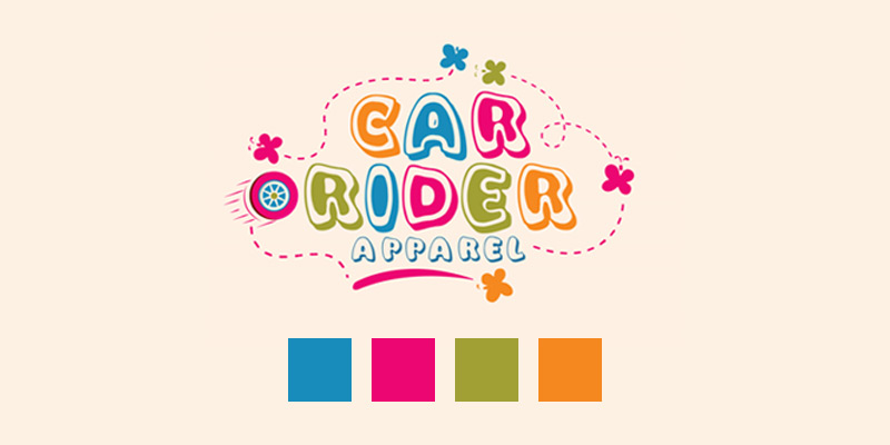
Fun equals whimsical and vibrant. If you’re unsure if your color scheme is “fun,” think about if it looks like something you’d find in a candy shop. Bright, warm colors that clash and “unnatural” colors like pink, purple, and lime green are a lot of fun.
- You can make a fun design by combining green, pink, and yellow.
- Rainbow uses a lot of different colors to make a bold statement.
- Red and green brings together energy and calm for a carefree mood.
- Pink and blue are bright and robust, making them perfect for a fun logo that stands out.
- Blue, green, and yellow work well together. Fun, natural, and trustworthy.
- Purple and pink are bright, mysterious, and great colors for a fun and exciting character.
- Blue and orange are a happy and warm combination.
- Green and purple work well together because of a warm undertone with better attraction.
- The logo’s color scheme of red and blue is a sophisticated take on a fun color scheme.
- Pink, yellow, and black are cute and fun, with a touch of reality and a reminder.
Serious logo color mixtures

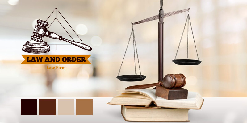
If the seriousness of your business is a selling point, like in banks, law, or medicine, the best colors to use are neutrals and deep colors, which show customers how seriously they should take your brand.
- Black and white with dark highlights are elegant, classic and add a splash of color with dark accents.
- A severe brand looks bold and trustworthy in blue and black colors.
- Use shades of brown, beige, and black for a primary and reliable look.
- Grey, tan, and gold is a classy color scheme that gives off a softly sad vibe.
- Dark and light blues are a mix of seriousness and friendliness, making for a trustworthy image.
- Brown and gold/yellow make you feel like you’re in a big and rich time from the past.
Audience-based color mixtures
Sometimes, a color scheme can show who a brand is trying to reach. The brand can stand out from its competitors by using patterns that people in that group like.
- Primary colors (Red, Yellow, Blue)are bright and catchy, making them great for logos that stand out or companies that work with kids.
- Pink and blue are soft colors that work well together to create a playful and cute logo often seen on baby items.
- Navy, white, and yellow are a sporty and energizing color combo, with navy as the base for the bright colors to stand out.
- Blush pink, gray, and yellow combination of warm, soft colors and neutrals makes for a fun and elegant look.
- Using purple, pink, and blue mixture as a deep, bright pink that some people adore, and blue goes well with both.
New Ways To Use The Colors In Your Logo’s Color Scheme

When you use a color range to make your logo, you must decide if one color will be the main focus or all colors you must use in a balanced way.
- Gradients: Use gradients to show off all of your colors smoothly. Give your logo depth and visual appeal by transitioning between colors that run from small changes to big and bright ones.
- Geography: Include abstract patterns that fit with your brand’s personality. Use smooth shapes for a warm and happy look, straight lines, and sharp angles for an intense and severe look.
- Coloring book: Think of your color scheme as a set of tools and use your imagination to creatively apply the colors to bring your logo to life. Uniquely use each color, like giving it to a specific part or putting it in a pattern so that each color gets the same amount of attention.
Conclusion
Finding the right colors for your corporate logo design is a fun challenge that will take some study and experimenting. Look into different color choices to find the one that fits your brand the best. Feel free to go to a professional business logo design company in your field to get ideas or feedback to help you make better decisions.
If you need help picking the right colors for your business logo, our team of artists is here to help. Working with our artists will give you new ideas and a wide range of color schemes for your logo design, whether you need an animated logo design, a mascot logo design, a monogram logo design, or a 3D logo design. Contact us!
Also Read: How to choose logo design wisely things to consider before hiring a logo design company and logo design services

Leave a Reply