Get Upto 60% Discount
Grab 50% Discount
for all custom logos
Please fill the form below & proceed
Kerning Definition – Beginner’s Guide To Learn Kerning In Typography

August 7 , 2020 Posted by admin
No matter how much or how little time you spend online, you must have seen a page where the typesetting seemed a little strange. Maybe there was a lot of space in between or maybe there wasn’t enough space in between.
What is the problem here?
The issue here is a Kerning problem.
What is Kerning?
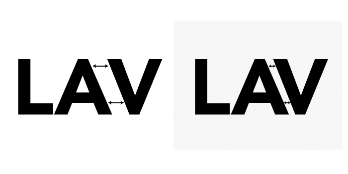
Kerning is the amount of space that we see between two characters, numbers, or punctuation marks. Kerning is the process that we use to adjust the space in between so that the gaps are the same size and the writing doesn’t look weird. Not only does it make the writing more aesthetically pleasing, but it also makes the writing legible.
Have you ever tried to create your own logo and then go, ‘I need a logo designer’ or Best logo designer near me because you just couldn’t adjust the spacing between the type? Don’t worry. You are not alone. A lot of people face this problem when they are designing a logo, poster, or any other visual for their business.
Why Do We Need Kerning?

When you select a font for your website, landing page, or you need a California logo design, sometimes the kerning just isn’t right. You won’t see it with all characters and letters, just some of them. One thing that we must mention here is that kerning doesn’t refer to the actual spacing between the letters, numbers, and characters. It refers to the perceived amount of space in between them. You use kerning to align the typography. You don’t use kerning to create spacing that is equal from every side.
The Purpose of Kerning

It might look to you that Kerning is an unnecessary process, and nobody gives that much attention to the small details. The truth of the matter is that it’s these little things that can make a difference. After you have created your design or have one created for you by a logo design company, adding this one step can make a huge difference to your projects. The bigger the typography is, the more you need kerning. This means logos, headlines, posters, and more.
How To Kern Font

This might look like a difficult task for you, but it’s not. Once you get the hang of it, you will easily be able to identify the area where you need kerning and do it immediately. Use the following tips to make the job easier.
Look for specific letter combinations
Some letters are harder to kern than others. These are letters that have a strong slant to them or extended sections. Also, pay attention to words that are written with all capital letters. Imagine that each letter is surrounded by a box. These are the letters that do not stay put inside the box and there will be gaps.
The letters that do not follow the imaginary box process are:
– Letters that are slightly slanted like A, K, V, W, and Y.
– Letters that have arms or letters that have cross strokes like F, L, and T
– Letter combinations like WA, VA, TF, and more.
Know the relation between letters and space
Although capital letters have a lot of kerning needs, that doesn’t mean that lowercase letters do not. The reason why lowercase letters need kerning is that rounded letters and straight-edged letters appear different when they are put together with each other. Pair them with their own kind and they will look different. Pair them with each other and they look completely different.
Understand point size
Whatever the size of your font, it will decide whether you need kerning or not. This means that letters appear different in different sizes. If you kern a letter at size 24 and then resize it, your work might be lost and you will have to do it all over again. That is why kerning should be the last step of the entire design process.
If you are working on a logo service and you know that it will be different for various mediums, then you will have to kern the typeface for each medium.
Know when to stop
There is such a thing as over-kerning and under-kerning. If you put the text in a tight space, it will become harder to read and understand. That becomes more so when the text is already small in size. Always make sure that readability and legibility are at the top of your mind whenever you kern.
Save kerning ‘til last
Like we mentioned earlier, kerning should be the very last step of your entire design process. That way, you won’t have to redo it after you make a change. Select your fonts, select the size, and then if you feel the need to kern then kern away.
Before you start kerning, make sure that you have given ample time to tracking and leading. Tracking is the process of applying a standard amount of spacing to all the characters in your content. It is the overall effect. Leading is the space between two lines of text. It is a common feature and almost every word processor that is currently available in the market has this option.
Conclusion
Now that you know what kerning is and how to go about it, you will know exactly what to do if your typeface seems a little off and weird. Keep the above tips in mind whenever you are providing logo design services in the USA, UK, UAE, Canada, Europe, Australasia, New Zealand, Europe, and Middle East countries, and you will be able to ensure likeability and legibility for your viewers.

Leave a Reply